LOGOS
The primary role of a logo is to identify a brand. Trends come and go, design tools and techniques will evolve, what we perceive a logo to be may even drastically change with time, but for all eternity the single most important goal of a logo will always remain this – to identify the person, product, business or service you’re designing it for.
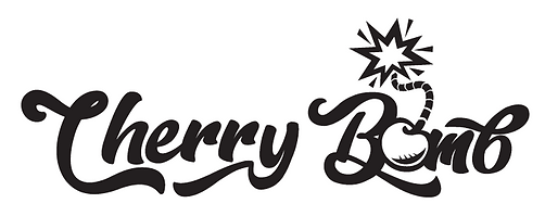
My process when designing a logo usually begins with the thumbnail sketching process (in this case I was trying out different names to use for my own personal photography business). I try to sketch out by hand many different ideas and then narrow them down to a few I feel best fit the function and need of the client.
Logo Process


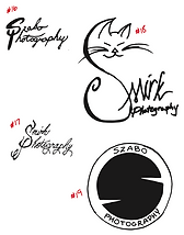


Then I will move to the computer to create the logo design in detail - changing placement, color and fonts to give a varity of concepts to choose from.


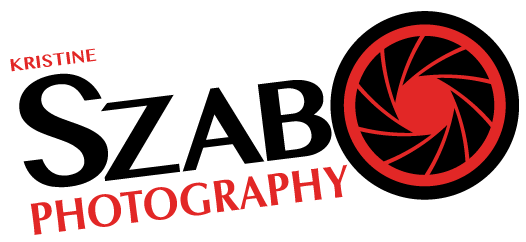
Once evaluated and modified to the client's liking a final approved version is chosen


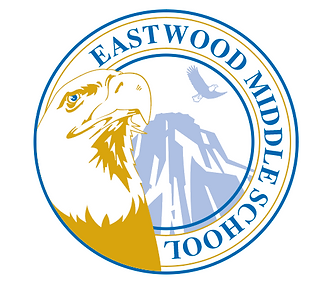
Middle School Logo
This logo was created using the school's mascot of an Eagle. They wanted a logo that represented pride and also conveyed their school motto "Where Learning Soars". Using two images of an eagle in this design helped achieve this request. By portraying the eagle in the foreground using a headshot with head tilted up and looking very regal gave the sense of pride, and using the school's color of gold also helped depict worthiness. The background is a faded eagle gliding through the air and with the placement of the mountain to illustrate the hight that it is soaring to exemplify the motto.
Motorcycle Names
In the motorcycle community many name their bikes and want custom made logos to either have cut vinyl to adhere to their vehicle or to have screen-printed onto apparel like shirts or sweatshirts. These logos need to be very clean but descriptive. Each logo needs to stand out and be unique since many individuals might name their motorcycles the same name or similar. These logos usually always use complete words unlike some typography logos that use initials in the design. These are two of the designs I have created recently.


Nine Dragons Restaurant
Nine Dragons, a very conservative restaurant that serves Chinese cuisine amid ornate wood carvings, traditional lanterns and exquisite glass artwork. The logo needed to represent a very formal and time-honored look. The classic colors of red, black and gold are used throughout the restaurant so of course it was also used in the logo. Red is such an important color in Chinese culture which is why it was used for the focal point of the design to frame the dragons which has a strong significance. Unlike the Western perception of a dragon as a violent, fire-breathing beast, the Chinese dragon symbolizes a calm, wealth and wellness bringing creature. The circle is an important cultural symbol representing harmony, the balance of the yin and yang and the duality of nature, which is an essential part of Chinese philosophies. Nine Dragons only has circular tables. They feel round tables encourages and makes it easier for everyone to participate and collaborate, plus all parties at each table can see each other.
EPIC FARM
Client for this design wanted a very basic and simplistic logo. Using the upper text in a slight curve allows the images of blueberries to nestle into the white space and seem less rigid and formal. By using the stray blueberry off the vine was a subtle element to give a more relaxed feeling as the blueberry used for the tittle on top of the lower case letter "i" in the Epic name. This was a decision to do for when the logo was going to only be used showcasing just the EPIC FARM name alone to simplify even more. This particular farm has a very large pick yourself blueberry patch that they welcome the public to visit and so they wanted the logo to not be formal but they still had a very set vision on the fonts they wanted to use.